I began by researching into logo designs for popular apps as well as apps that have relevance to my crime mapping product.
![]()
![]()
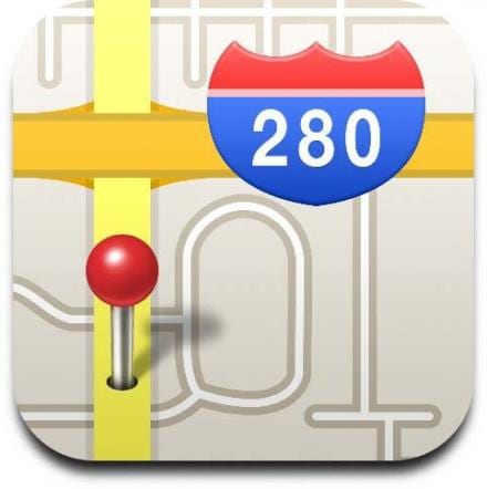
I quickly found that the logos for many apps that involve some kind of GPS or mapping software often include some kind of push pin icon. This makes the app instantly recognisable as being a mapping app and it is easy for users to instantly get a good understanding about what the app is for.
I also began researching into the most easily recognisable icons on the topic of vandalism and crime prevention. This is important as it is key for the logo to be as simplistic as possible whilst also giving enough information on what the app is about.
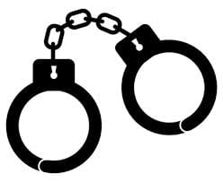
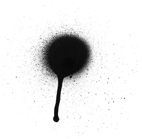
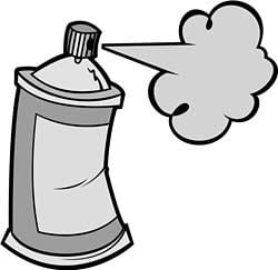
After some initial research I quickly found several recurring images that the user would instantly associate with crime and vandalism

From these I began to create some simple logo designs that incorporated some of these ideas.
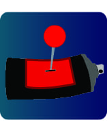
Initially I created this design of a spray can being impaled by a map pin icon. I like this design as it sends a strong message that the app is designed to help stop vandalism and graffiti whilst also telling the user that the app is based around GPS and electronic mapping.
However I do think that the logo is a little too complex to fit into a small icon on a smart phone or tablet.
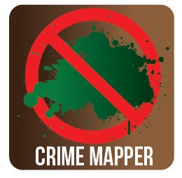
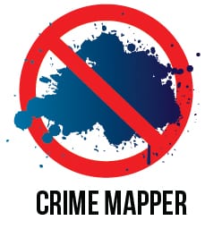
These designs are much simpler and I believe they still effectively portray the anti graffiti message however there is no reference to the mapping aspect of the app which I feel does need to be implemented into the logo.
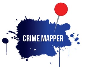
I like this design and think it would work well as the logo on the main menu screen of the app as well as the main website. The paint splatter portrays the graffiti aspect well and the use of the pin icon helps to connote the mapping aspect of the app.
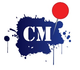
Here I decided to simplify the previous logo. I believe this more simplified logo could be used as the app icon as there is less text and would be easier to read in a small icon.
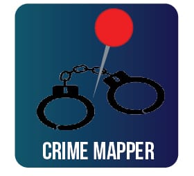
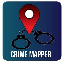
I looked further into designing icons for my app, I think these work best as they make good use of the iconography of both the map pin icons and the hand cuffs which will allow users to have a good idea what the app is about just from seeing the logo. This helps the app stand out amongst the other similar apps on the app store.