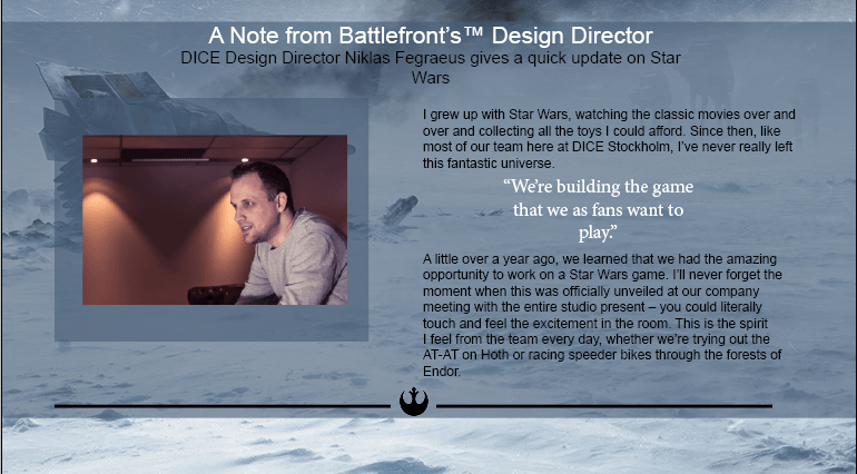
Research & Development Task – Initial Ideas

Idea #1
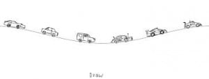
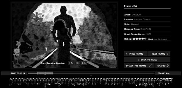
For my first idea I took inspiration from Aaron Koblin’s Johnny Cash Project.
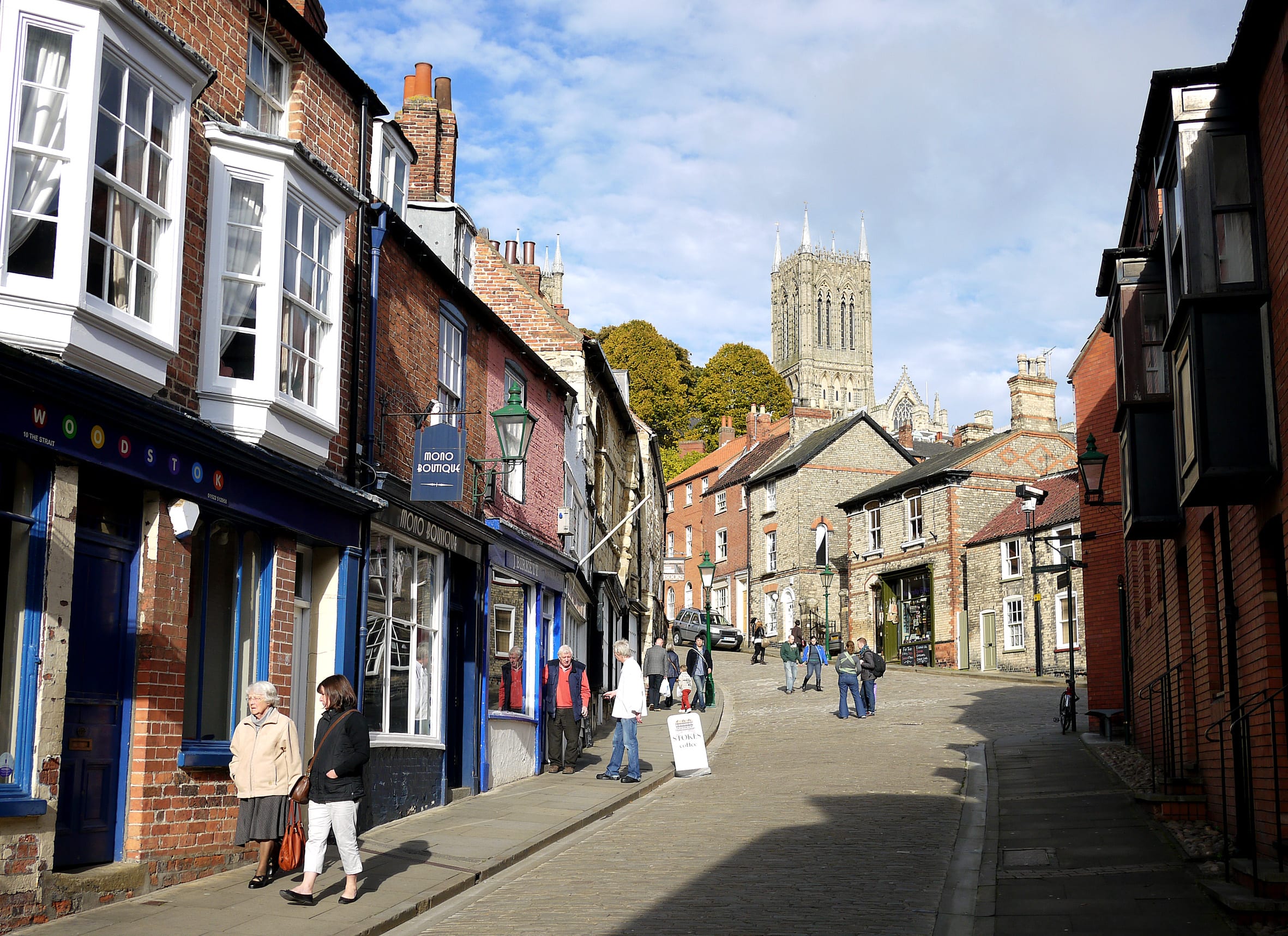
In a similar style, the exhibition would involve shooting a short video showcasing either Lincoln as a whole or focusing on the Frequency festival, this could feature some of the main attractions of the city such as the cathedral and Steep Hill.
Much like the Johnny Cash project, participants are  then given a single frame from the video and tasked with recreating the image using a simple drawing app on a tablet. This could be easily achieved using one of the many collaborative whiteboard apps available on the app store.
Each frame is then compiled together in order to recreate the original video.
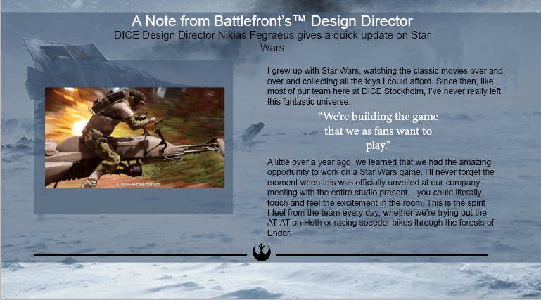
Lincoln-Steep-Hill

Idea #2
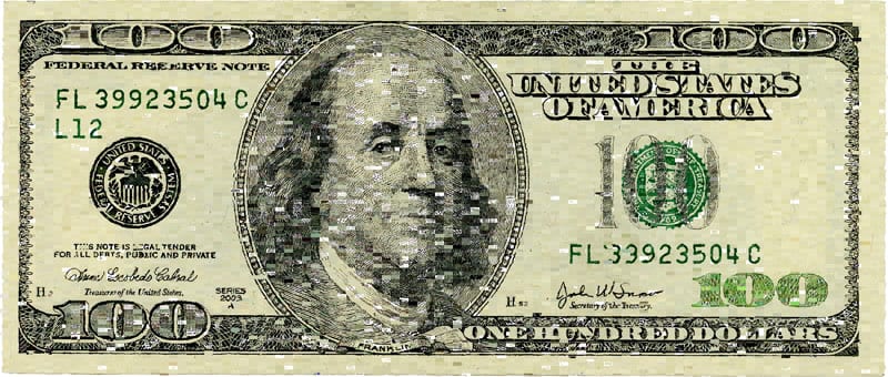
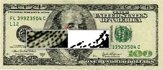
Another idea along these same lines and also inspired by Koblin’s work 10,000 cents. Participants would be given a very small portion of a large photograph and asked to recreate it on a tablet drawing app. The original photograph that is being recreated would have to be relevant in some way to Lincoln as a whole, or more specifically, the Frequency Festival. It would perhaps be a good idea to use an image of Lincoln’s most easily recognisable landmark, the cathedral. This would be interesting as it would fuse together the new digital media aspect that is being celebrated in the festival with the old, historic backdrop that the city is famous for.
After the participant has finished, their drawing is then added to the bigger image which is being displayed on a large screen. Participants would be able to see the final piece being slowly constructed as each small portion is added. This, I believe, would create a very interesting and engaging instillation that would draw in the high street audience.
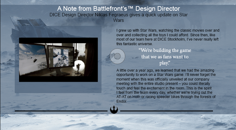
Idea #3
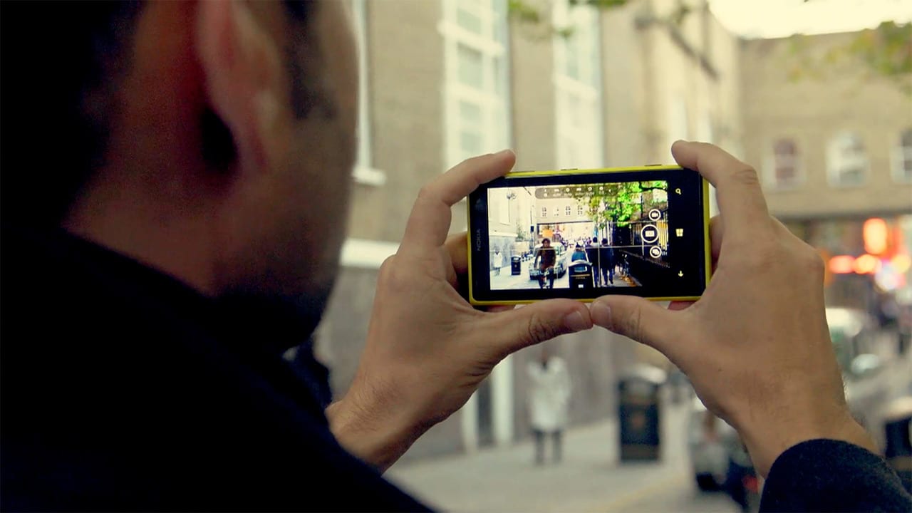
Similar to the previous idea, participants would be given a small portion of a larger photograph, however rather than using a drawing app, they would be asked to recreate the image using their Smartphone camera. As with the previous idea, these photos would then be stitched together to recreate the original picture.

Smartphone camera street photography review

I like these three ideas as they showcase the power of digital collaboration that is now accessible to all thanks to digital media, whilst also demonstrating the diversity and the importance of the individual.
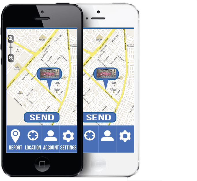
Idea #4
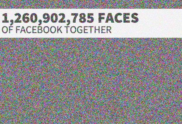
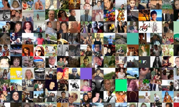
Taking inspiration from Natalia Rojas The Faces of Facebook concept I have thought of a concept The Faces of Frequency, an exhibition that uses Facebook profile pictures to create a collage of visitors to Frequency whilst also using Facebook to geotag and create a digital map of where people have travelled from to get to the festival. This gives an interesting visual representation of the people who visit the festival whilst also showcasing just a hint of the data that is available about us through social media.

81d031279bcb1a9c401d4548d568ed18 twitter-maps
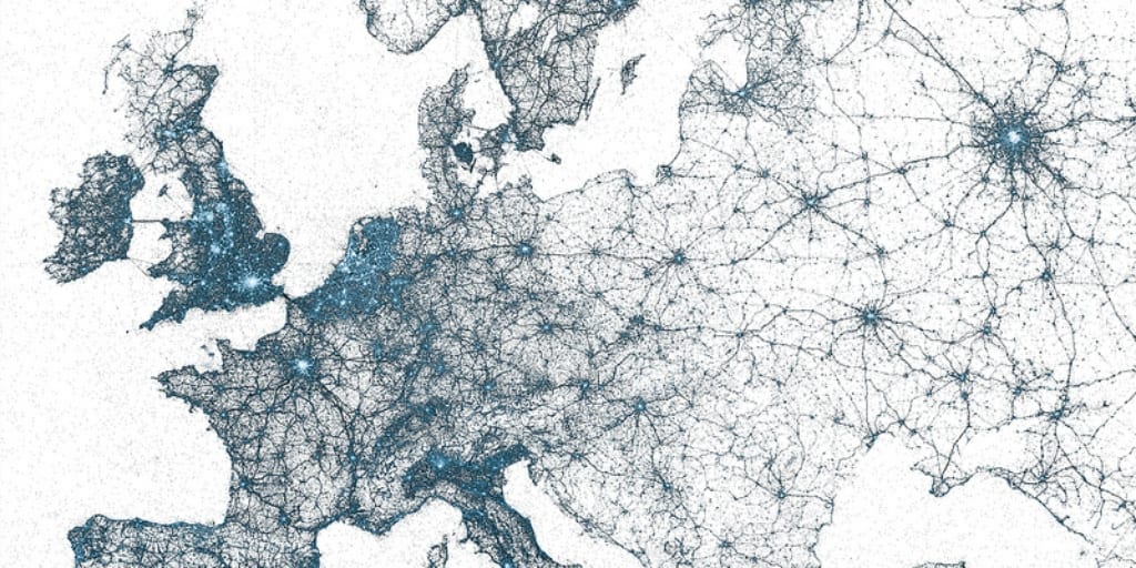
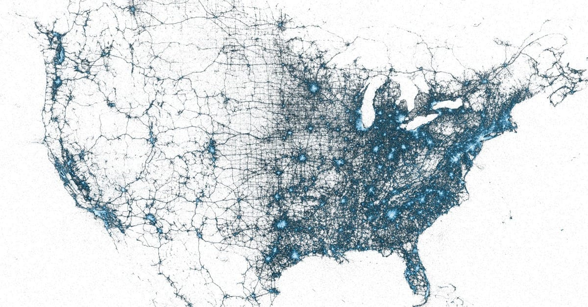
For this idea I also took inspiration from other geotagging mapping projects such as this one, which shows every geotagged tweet sent from 2009 to 2013. Every dot represents 1 tweet and creates a beautiful visualisation of this digitalised modern society in which we all live whilst also showcasing just how much social networking is a huge part of our lives but many of us no longer notice.

I believe these ideas would be a great addition to Frequency as they would engage with the more casual High street audience in a fun and entertaining way whilst also remaining in keeping with the festival theme of Liberation

Research & Development Task – Research

For the Research and Development task we were asked to develop ideas for the 2015 Lincoln Frequency Festival. Although the festival caters for ‘art goers’ it also has a large family following and so must also appeal to more casual visitors to the festival. The festival’s manifesto is all about making digital available to everyone.

Challenge: 
Come up with innovative, playful and engaging work to catch this High Street
audience. We want you to work with the realms of what’s possible. What’s around
you that you can use? Can you actually pull this idea off? Where would the work be
sited? How would it be presented to audiences?

Theme: the theme of this year’s festival is Liberation:
How apt in this the 800th anniversary of the signing of the Magna Carta that the internet is charged with debate our online rights to anonymity and equality. Moving forward are we to be considered equals, collaborating in an Utopian experiment to interconnect the world, or redefined as consumers to be channelled through a handful of retail portals whilst mined for commercially useful data?

For my initial research I decided to focus on looking into an aspect of digital media I have a previous interest in, collaborative exhibitions that rely on a large amount of people, each contributing a small amount towards a larger end goal.

I initially researched a digital media artist named Aaron Koblin as I had seen some of his previous work in one of my lectures. In a TED Talk, Koblin talks about Amazon’s Mechanical Turk, a crowdsourcing marketplace where online users can collaborate to complete tasks that artificial intelligence can not. Much of his own work relies on this philosophy of using online crowd sourced  collaboration from hundreds or even thousands of people contributing to the final goal.

Single Lane Superhighway
This is one of Koblin’s previous work that grabbed my attention. Using a simple online drawing tool, contributors were asked to draw a car facing to the right which would be added to an online parade. The project was completed upon reaching 50,000 hand-drawn cars which continue to drive in a never-ending parade.

superhighway

10,000 cents
This is another of Koblin’s projects that expands on the idea of outsourcing work to a huge online workforce. Using a custom online drawing tool, thousands of individuals working in isolation from one another painted a tiny part of a $100 bill without knowledge of the overall task. Workers were paid one cent each via Amazon’s Mechanical Turk distributed labour tool. The individual images were then compiled together to recreate the original image. Each individual image is available to view online.

 tenthousandcentsbillbil4

http://www.tenthousandcents.com/

According to Koblin “The project explores the circumstances we live in, a new and uncharted combination of digital labour markets, “crowdsourcing,” “virtual economies,” and digital reproduction.”

The Johnny Cash Project
My favourite of Koblin’s projects however, is The Johnny Cash Project which he worked on with Director Chris Milk. Participants were each given a single frame of the music video for Johnny Cash’s song “Ain’t No Grave” and asked to recreate it using a simple online drawing tool. Each frame is then put together in sequence to create the video.
20101101-bn74pb4twsdn9hw4pjh53sk166
http://www.thejohnnycashproject.com/

I was really inspired by this project as I feel that the video has an almost organic, living feel to it. When put together, each drawing forms together to become a cohesive narrative however it also showcases the diversity of each individual artist. It showcases how collaboration between thousands of isolated individuals can create something incredibly powerful and it is a perfect tribute to such a well loved artist.

I also focused on the ‘Knowledge Sharing’ aspect of the festival’s manifesto:
Never before have we been able to step so completely into the lives of others. We
learn about each other via social media, the stories unfiltered by the established new
media portals.

The Faces of Facebook
I came across artist Natalia Rojas and her project The Faces of Facebook, a website and app that shows each of Facebook’s 1.2 Billion users on one page by creating a huge collage of every single Facebook profile picture. I found it interesting as it shows just how much the digital media and social networking has become a huge part of everyone’s lives.

51c850ec-98bf-48c8-964c-ef2ae4c58808_Screen-Shot-2013-09-26-at-12-23-22-PM ddf47d92-54a5-40c9-9b11-c6a7ccdb6354-620x372

http://www.thefacesoffacebook.com/

However it also highlights that on social media, people present the best, most desired version of themselves, rather than the real person. I found this interesting quote on Doclab.org:
“Facebook we are not who we are, but who we long to be – and the person that we want other people to see us. Dreamed identities”

I feel that an exhibition that explores these issues would fit well within the liberation theme of this year’s Frequency Festival


Digital Magazine- Weeks 3 & 4

For our next of workshops we were tasked to design and create a digital magazine that would be suitable for an ipad app. Our group originally decided to design an app based on Sci-fi but after some initial research we found that there were already several of these available on the app store. We therefore decided to go for a more niche topic in the Sci-fi genre and decided to design a digital magazine on the Star Wars franchise.

I was tasked to create the article page for the upcoming Star Wars Battlefront game

Page 1  Page 1 video play

The first article is about introducing some of the history of the previous games and some information about what fans can expect from the new game set to be released next year.
As this is a digital magazine I wanted to make use of some of the more interactive features that the digital platform has to offer. For this article I embedded the E3 announcement trailer for the game along side the article. This makes good use of the digital platform as it enables the user to access extra content that would not be possible in a print magazine.
I added the play button to the thumbnail of the video to make it clear to the user that it is a video rather than just a picture, the icon is set to disappear once the video begins playing.


Page 2.1  Page 2.2 Page 2.3

The second article is about the development of the game, because of this I included several pictures of the development of the game that can be swiped through or play automatically as a slideshow. This too makes good use of the unique features that are available to the digital magazine platform.

Interface Design- Week 2

I have now moved on to designing the interface for my app. I began by sketching a rough design on paper to get an initial idea about what I wanted.

image

Once I had my initial design I then moved into Illustrator to recreate my design digitally.

Icon screen


Here I have created a mock up of how the icon logo would look on the iOS interface. The logo is simple enough to fit well into the small space required whilst also giving a good idea what the app is about.

Main screen


This is my final design for the main interface of the app. I believe it is a successful design as it has many features that make it simple and as easy to use as possible:

The main body of the app taken up by the map that is used to report the location of the crime. I felt that it is the most important part of the design and so I allocated the most space possible. The map will also make use of the pinch to zoom feature that has become common place across most applications that require the user to zoom. However there is also a zoom slider at the top left of he screen for users that are unfamiliar with pinch to zoom.

In order to keep the app as simple and easy to use as possible the main screen contains just four main buttons:

  • Report: when the user spots something that they want to report they press the report button, this will then take them to the application camera for them to take a picture. Once the picture has been taken the thumbnail of their picture will appear on the map and can be dragged to the location that the user took the picture. All the user has to do is press send and the report will be sent to the appropriate authority.
  • Location: The location feature makes use of the GPS function built in to most modern devices. If the user is having difficulty finding their location on the map they can use the location function automatically find where they are on the map
  • Account: The account button takes the user to their personal account where they can view previous crimes that they have reported. from here they can also view notifications that authorities will send once the report has been dealt with. This is one of the most important features of the app as it allows for a greater level of communication between the authorities and the public and lets the public know that the council is acting on reports from the app users.
  • Settings: Allows the user to change the general settings of the app.

I feel that this design is effective in achieving the main goals of the app and successfully allows the general public a simple to use, better platform for reporting minor crimes in their local area as well as creating a better channel of communication between the the public and the local authorities.

Logo Design- Week 1

I began by researching into logo designs for popular apps as well as apps that have relevance to my crime mapping product.

Google-maps-icon apple maps forevermaps2-icon-220x211

I quickly found that the logos for many apps that involve some kind of GPS or mapping software often include some kind of push pin icon. This makes the app instantly recognisable as being a mapping app and it is easy for users to instantly get a good understanding about what the app is for.

I also began researching into the most easily recognisable icons on the topic of vandalism and crime prevention. This is important as it is key for the logo to be as simplistic as possible whilst also giving enough information on what the app is about.

After some initial research I quickly found several recurring images that the user would instantly associate with crime and vandalism

finger print handcuffs spray-paint-4 Spray Can


From these I began to create some simple logo designs that incorporated some of these ideas.

initial idea 1

Initially I created this design of a spray can being impaled by a map pin icon. I like this design as it sends a strong message that the app is designed to help stop vandalism and graffiti whilst also telling the user that the app is based around GPS and electronic mapping.

However I do think that the logo is a little too complex to fit into a small icon on a smart phone or tablet.

initial idea 3 initial idea 4

These designs are much simpler and I believe they still effectively portray the anti graffiti message however there is no reference to the mapping aspect of the app which I feel does need to be implemented into the logo.

initial idea 2

I like this design and think it would work well as the logo on the main menu screen of the app as well as the main website. The paint splatter portrays the graffiti aspect well and the use of the pin icon helps to connote the mapping aspect of the app.

initial idea 5

Here I decided to simplify the previous logo. I believe this more simplified logo could be used as the app icon as there is less text and would be easier to read in a small icon.

initial idea 6 initial idea 7

I looked further into designing icons for my app, I think these work best as they make good use of the iconography of both the map pin icons and the hand cuffs which will allow users to have a good idea what the app is about just from seeing the logo. This helps the app stand out amongst the other similar apps on the app store.